

Avoid these colour choices that make your home look smaller |

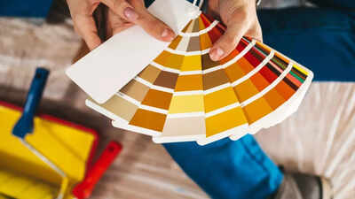
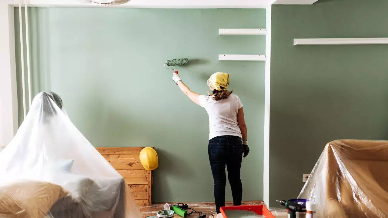
The colours you pick for your home walls do more than just decorate, they shape how big or small your rooms feel. While darker or very bright colours may seem stylish, they often absorb light or overwhelm the senses, making rooms appear cramped and cluttered. This is especially important in smaller homes or apartments where every inch counts. Choosing the right shades can create an open, airy atmosphere that invites light and enhances space perception. Understanding which colours to avoid and which to embrace, is key to making your home feel more spacious without expensive renovations. In this article, we’ll highlight common colour mistakes that shrink rooms and share expert tips to help you transform your living space with smarter colour choices.
Colour choice mistakes to avoid for your home
Dark colours that absorb light and shrink space
Deep shades like navy blue, charcoal, dark green, and brown soak up natural and artificial light, making walls seem closer than they are. If you want to keep rooms feeling open, opt for lighter shades like soft beige, pale blue, or warm greys that reflect light and brighten the space.
Bold accent walls that break visual flow
A single, intense accent wall may look stylish but can cut off the room’s natural flow, making it feel boxed in. Instead, use consistent, soft colours on all walls to create a seamless look that visually expands your space.
High contrast between walls, ceilings and trims
Strong colour contrasts split the room into segments, which can feel visually cluttered and smaller. Matching tones across walls, ceilings, and trims creates harmony and makes the room appear larger and more inviting.
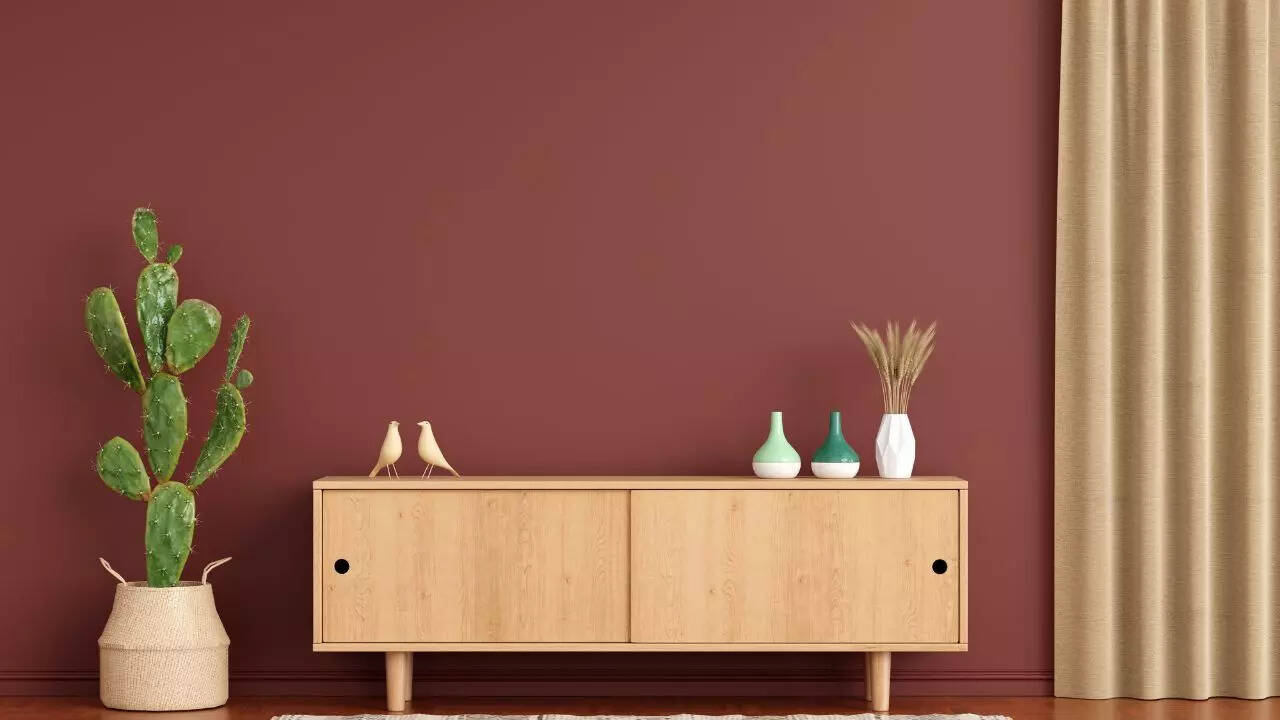
Overly bright or saturated colours that overwhelm
Colours like fluorescent reds, bright oranges, and mustard yellows can overpower a room, making it feel noisy and confined. Use muted or pastel versions of these shades for a softer, more spacious feel.
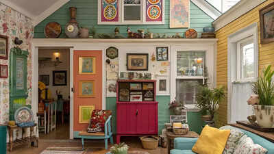
Too much colour clashing
Using multiple clashing colours in a small room adds visual chaos, which can make the space seem cramped. Stick to a balanced colour palette with complementary shades to keep things calm and airy.
Summary table: Colours to avoid vs better choices
To make your rooms look bigger, stick with soft, light-reflecting colours and maintain visual continuity throughout the space. Avoid jarring contrasts and busy colour combos. Adding texture with fabrics or décor can add depth without shrinking the room. These subtle but effective colour choices will help your home feel bright, open, and inviting.Also read| The dark side of air fresheners: 7 harmful effects to avoid and safer ways to freshen your home